Digital marketing is becoming more and more popular (and necessary) as the age of technology yields young adults with a lot of spending power and no knowledge of what life was like when you had to use books to do research and pay $.25 to make a phone call in public.
But does the age of digital media mean the end of the era of good old-fashioned large-format print ads?
We don’t think so. We just know it means that your print ads have to be really good.
We’ve done some exciting large-format print work in the past year that we think showcases how effective it can be when done well.
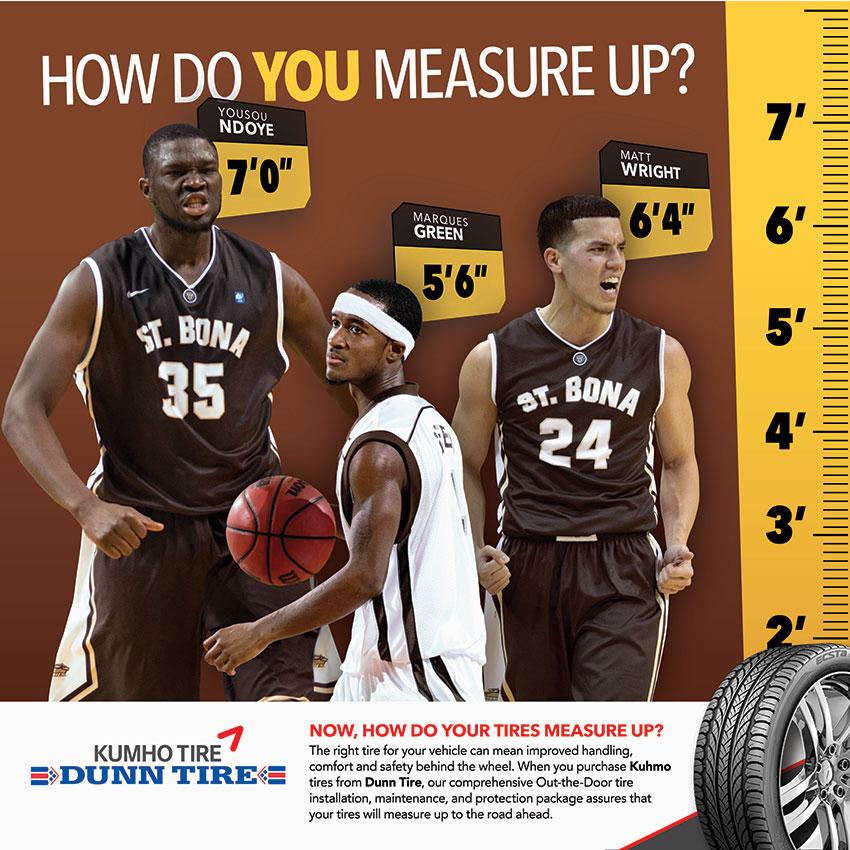
Combining two of our clients into one exciting project, Dunn Tire, as a sponsor of St. Bonaventure, was given placement of three banners for the Family Section of the Riley Center for basketball games.
Sponsorships are a great way to promote your business. By aligning yourself with another community institution, it immediately ups your credibility with its supporters.
We created banners that don’t just promote Dunn Tire. They claim ownership of the Family Section. The Dunn Tire Family Section promotes a loud and proud crowd that’s safe for the whole family – no drunk frat guys screaming in your child’s face (just kidding. It’s college basketball, not the Bills preseason).
Then we created something really fun. Your tires better measure up to the road ahead. And speaking of measuring up, how do you measure up to the Bonnies star players? An actual-size poster shows not only the heights of some of the SBU basketball stars, but lets you see what it would feel like to stand right next to them. In an engaging and interactive banner, fans can’t resist the urge to stand next to the 7′ center or tower over the 5’6″ point guard who is still a better basketball player than you can even dream of being.
We also created some eye-catching banners for The Sinclair building, owned by Ciminelli Real Estate Corp., as it prepares to open its apartments for rent. The Sinclair is an old hat making factory, Sinclair, Rooney & Co., that opened in 1909, and the new owners wanted to keep the turn-of-the-century luxury feel while thoroughly modernizing the apartments inside. The logo for the building itself is a hatpin, the same as that used in print advertisements 100 years ago.
We chose iconic hats from that era, the kind of hat that tells a story about the person wearing it. Just as you can tell how cool a person is today by what kind of sunglasses they wear, in the early 20th century the hat told the story. We created characters around these iconic hats, and created banners to tell their stories. Because The Sinclair is, after all, an homage to Buffalo’s rich industrial past and the great lives that were lived there.
Storied pasts brought to life on the side of a building are compelling, and interactive banners that appeal to sports fans are engaging, but sometimes you just need something eye-catching. Something that’s bright, well-designed, and memorable all on its own. When the Buffalo International Film Festival asked us to create some street signs promoting the upcoming event, our designer really knocked it out of the park (…the North Park) creating something memorable and just plain cool.
Print marketing may be an old-fashioned medium, but if you do it right, it can be a lot more compelling than people think. And at TQS, we know that whether it’s a digital banner ad or an actual banner, engaging your audience is the name of the game.
Sign up for our newsletter...
Give us your email and get our stuff delivered to your inbox. You might not regret it.
Thanks for subscribing! You won't be sorry.
Uh oh. Something went wrong.
