
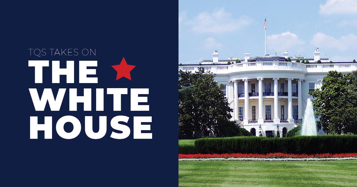
It looks like the White House has rebranded its logo…
So we asked our staff, “Uh, what do you think?” Some responses included insightful and informed perspectives from our savviest of professionals. Others, well… didn’t. And still some takes were presented with such a reckless indifference that you have to wonder if it was a mistake to even bring it up in the first place. In any case, each take is definitely worth reading. Enjoy!
Emily
I am pleased to report that I have nothing negative to say about the White House logo and typography. I think it looks nice. It reminds me of the White House. Good job.
Lisa
I prefer simplified logos over very detailed ones as those usually tend to look more modern which I gravitate to. It’s almost like this version is still trying too much. If you want to go simplified you need to go all the way. I would have liked to see an actual succession of logos side by side rather than having to click links. This article was a tad hard to follow.
Stephanie
I’m far from a designer, so I don’t have much to say on that front. But, I will say that I’ve never realized that The White House logo has been changed administration by administration.
Steve
I can’t decide if I’d like to have an opinion on this or not. On one hand, I feel like I should have an opinion, you know, working in marketing and all. On the other hand, though, I just can’t bring myself to care about nuances in type and drop shadows on the logo for a government agency. They shouldn’t be concerned about selling anything other than credibility, and I suppose a graphic of The White House is credible enough—whether blue or white or whatever. I’ll hang up and listen.
Jerry
These versions present either a blue building with white columns or a white building with blue columns. That doesn’t make any sense. It’s white. It’s called the White House. It’s not the Blue House. Wait, are they planning on painting it?
Chris
Older versions seemed to be a lot more detailed, which challenges my logo design sensibility. I’m more old school when it comes to marks… flat is better because it more easily translates to wherever you want to use it. In this version, they managed to add in more detail that had disappeared in the last version, while still maintaining a “flat” style.
It’s borderline too much detail for me style-wise, but it works. The bigger issue I have is with the different versions I’ve seen. I think their rollout is a bit shaky. I’ve seen versions with different fonts, and the version where the building isn’t white just feels odd (see Jerry… his comment, not him). Honestly, I think the super simplified version they use in the website header is better (though it could use a touch more detail in the windows, maybe?).
Tyler
You know what, I can’t figure out which is the new one. The article links to one, has a different one in the body, and the whitehouse.gov website has a third. They’re all fine. Better than the old ones with the weird shading and stuff.
James
I think it’s cool there are two different typefaces based on context, where one is more formal and the other is less so. Like, if I’m working at the White House, an announcement celebrating Champ’s birthday shouldn’t look the same as a declaration of World War III… right?