
The Challenge:
In today’s digital world, while things move fast online, there’s still something really impactful about the tangible quality of print. And for a business like Falconer Printing, their website isn’t just a place to list what they do. It’s actually an extension of their craft—a digital showroom that absolutely needs to convey their precision, their commitment to quality, and their strong brand identity. After all, if you’re in the business of making powerful visual impressions for your clients, your own digital storefront has to do the same, right?
That’s precisely the challenge and exciting opportunity we saw when we teamed up with Falconer Printing for their website redesign. Their previous online presence, while it got the job done, it didn’t quite capture that vibrant, detail-oriented essence of their amazing work. It was missing that visual punch and the easy engagement their brand truly deserved. More importantly, it wasn’t really helping them connect with and bring in new clients as effectively as it could.
The Solution:
Our main goal for Falconer Printing was super clear: let’s create a website that not only looks incredible but also actively works to connect with visitors and turn them into valuable leads. We knew we had to move beyond just putting information out there. Instead, we wanted to craft an experience that truly mirrored the modern, dynamic business Falconer Printing is. This meant building a site that really speaks to the visual nature of print, showcasing their expertise through top-notch design and interaction.
Here’s how we approached it:
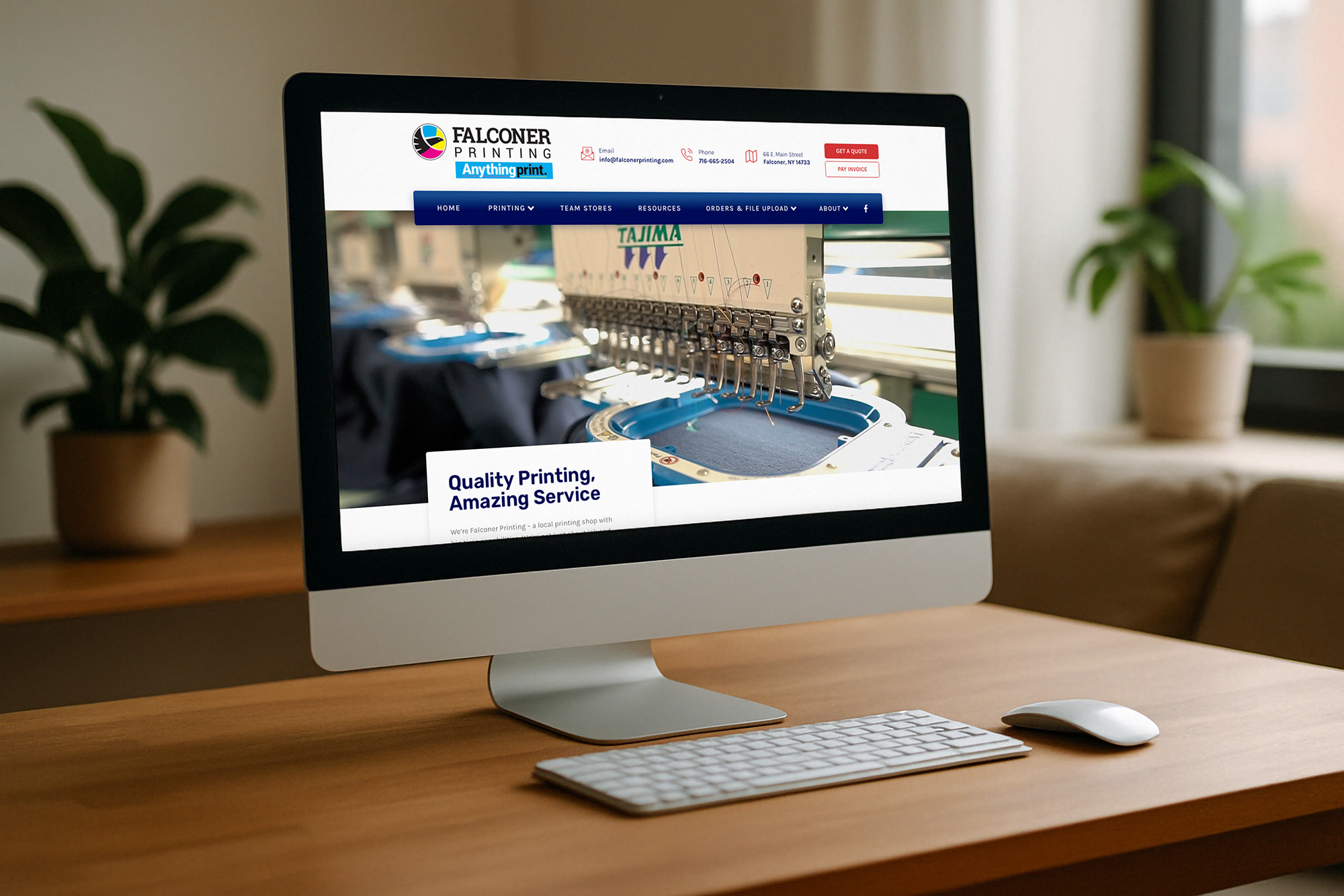
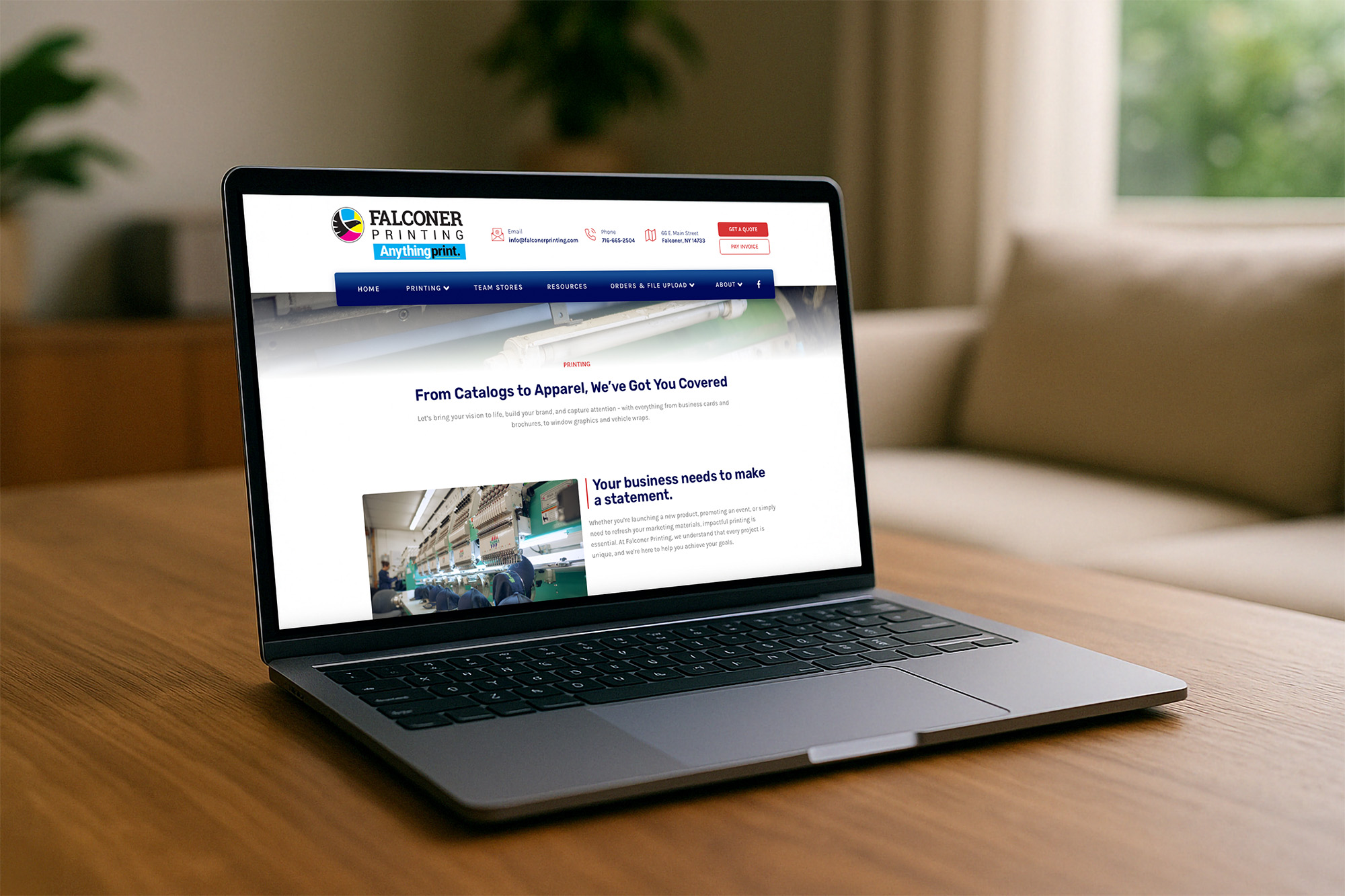
- Immersive Visuals That Tell a Story: You’ll see it the moment you land on their new homepage: a stunning, large-format background video that captures their personality. This isn’t just for show; it immediately pulls you into the world of printing, letting you see the precision, the passion, and the real results of Falconer’s work. It creates an immediate emotional connection that simple static images just can’t quite capture, reflecting the very visual output of their business. We also included subtle yet really captivating layered scrolling effects throughout the site. This adds a sense of depth and interaction, making your experience feel more dynamic—less like just flipping through a flat catalog. It’s about drawing you into the content, not just presenting it to you.
- Clarity and Conciseness are King: We did a deep dive into their content, trimming down extraneous copy that wasn’t really serving a direct purpose. Today’s web user has a pretty short attention span, so every word truly counts. By being concise, we made sure the key messages were impactful and super easy to digest. This helps prevent information overload and keeps visitors focused on what matters most to them.
- Compelling Calls to Action (CTAs): A beautiful website is fantastic, but if visitors don’t know what to do next, you’re missing out on real opportunities. We strategically placed and designed much more compelling Calls to Action (CTAs) all over the site. Whether it’s “Request a Quote,” “Explore Our Services,” or “Contact Us,” these clear, inviting buttons gently guide users towards taking that next step, turning curious browsers into active prospects.
The Results:
From our perspective, what truly makes this new site so effective and engaging? It really comes down to a fantastic user experience (UX) combined with strategic conversion pathways.
Those visual elements—the video and layered scrolling—aren’t just nice touches; they actually contribute to a richer, more memorable UX. When users are engaged and genuinely enjoy their time on your site, they’re much more likely to explore further, start to trust your brand, and ultimately, get in touch or take action. By making the site visually appealing and interactive, we’ve helped reduce how quickly people leave and increased the time they spend on the site – which are both critical signs of good engagement.
Plus, by streamlining the content and boosting those CTAs, we’ve basically removed any friction from the user’s journey. Visitors can quickly find the information they need and are clearly directed towards their next step. This focus on intuitive navigation and clear conversion points is absolutely crucial for turning website traffic into actual business opportunities.
Falconer Printing’s new website is a perfect example of how a thoughtful, user-centric redesign can truly elevate a brand’s online presence, drive engagement, and generate those valuable leads you’re looking for. It’s no longer just a place to find information; it’s a powerful tool that works tirelessly for their business.
The Pitch:
All that said, don’t take our word for it – check it out for yourself! And if you’re in the market for a new website, designed to engage and convert for your business, get in touch with us today! We’d love to help you create an amazing online experience for your customers and prospects!
Sign up for our newsletter...
Give us your email and get our stuff delivered to your inbox. You might not regret it.
Thanks for subscribing! You won't be sorry.
Uh oh. Something went wrong.
We respect your privacy and take protecting it *really* seriously. Seriously.