
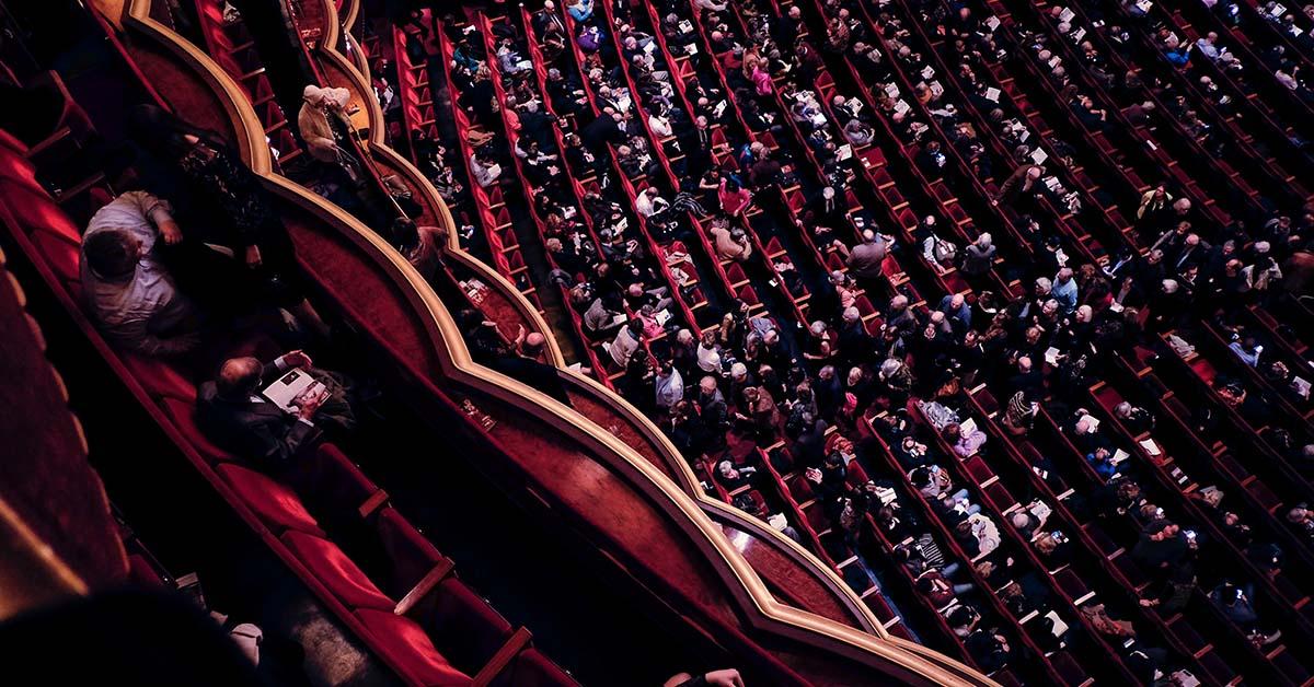
The world-famous 43North Finals pop off at Shea’s Performing Arts Center in Buffalo on Thursday, October 28.
Everyone with an entrepreneurial spirit in Buffalo is asking, “Who will take home the $1 million grand prize this year?!” We might not have an answer for that—but when we look at the 19 finalists, one thing is for sure: We all seem to have our favorites.
Here’s who we’re backing in 2021.
Steve’s pick: Akala
I love what Akala is all about. Providing guidance and advice to high school students as they begin to chart their course is such an important and meaningful purpose. And the fact that so many students are potentially going without this service is disconcerting. I hope the service truly is available and affordable for everyone—it would be great if they could partner with public high schools in underserved communities to make this a reality. I’m very interested to learn more about how this service works and where they anticipate it making the greatest impact.
Chris’s pick: CheelCare
While a few of these finalists, including Zealot Interactive, really resonate with me (pun intended), there’s one in particular that I feel is a real standout: CheelCare. Unlike many of the other competitors, there’s no need for a bunch of industry jargon and buzzwords to try and sound impressive. CheelCare is a company with a solid, well-thought-out line of products that fill a need. They’re able to make a direct impact in the lives of people bound to wheelchairs—stuff that can truly change lives. I’d love the opportunity to work with them on their brand.
Alyssa’s pick: Ognomy
I appreciate the work that Ognomy is doing to bring sleep apnea testing into homes. I can’t imagine that spending a night in a sleep lab results in a very comfortable situation for a patient. Anything that helps to remove barriers for people to get diagnosed and treated and improve their overall well-being is a huge boon to public health. I love that they’re using technology we’re already accustomed to using (mobile apps and video calling) to meet their goals. I also really like the simplicity of their logo and their unique name. Best of luck in the final rounds of competition!
Tyler’s pick: NixCode
I think no-code solutions are the future of software. NixCode’s slogan, “The WordPress for App Development,” is extremely appealing, and the purpose of the company is immediately made clear in the name. The free-to-start model is also very appealing to coders of every level.
Jerry’s pick: BetterMynd
BetterMynd seems like a group not only addressing the importance of mental health, but is targeting individuals who are often the most in need of said clarity. The post-COVID (or are we still mid-COVID?) environment has only added to the complexity of personal development, but it deconstructed the playing field of any stability typically offered to students in their most troubling and informative years. BetterMynd is seeking to supplement all of these shortcomings with resources that may help return normalcy and growth opportunities to students. I think their mission alone warrants whatever support we can provide them, and marketing to such a strong need should make for the most altruistic venture of a lifetime.
Franklin’s pick: Zealot Interactive 
I like that Zealot is selling itself as a “Peloton for music.” In just three words, I can understand what the company is trying to accomplish without inside baseball, industry-specific vocabulary that a generic consumer maybe wouldn’t understand. Having four lines through the “Z” in their logo to emulate the strings of bass guitar is a clever touch. I should note that I play the guitar and the drums in my free time, so I may be a bit biased here.
See a snapshot of Zealot Interactive.
Lisa’s pick: KapitalWise
I love the KapitalWise color scheme and the simplicity of the logo. I could definitely see this working well for collateral like business cards and other print pieces, which are some of my favorite projects to work on as a graphic designer. Usually, I’m really drawn to geometric and simplistic logos. Sometimes less is more!
See a snapshot of Kapitalwise.
James’s pick: BetterMynd 
I am pulling for BetterMynd because mental health has become such a concern for so many people these days, especially college students who are struggling to find their place in the world. Licensed therapy on a mobile platform seems like a no-brainer solution to this problem. From a marketing perspective, let me just say that this logo rules. And the typography, icons, and web designs are so visually interesting and inviting—they help make the brand seem sophisticated without being too intimidating. I’ll add that the company’s elevator pitch and web copy are A+.
CLICK HERE to get FREE tickets to this year’s 43North Finals!
Looking for more marketing content?
Check out our blog page for more, and don’t forget to follow us on LinkedIn, Facebook, and Twitter!