If you’ve been following along with this blog for any considerable period of time (or any period of time, really), you know that about once a month, we cut the nonsense and try our best to prove to you that our days aren’t spent building blanket forts, eating Funyuns and playing with nerf guns like we’re at some kind of adult day camp/Silicon Valley start-up. Today is that day, and this month, we’re shining our spotlight on our ongoing work with the Tanglewood Group.
As we’ve mentioned before, we love getting the chance to work on projects that start with an office-wide brainstorm around our ping pong/conference table. We get really excited when clients come to us with a whole new concept or product and ask us to develop its branding from the ground up—which is why we’re especially proud of our collaboration with the Tanglewood Group on the brand and marketing collateral around Field of Dreams, their gorgeous new assisted living community for the young at heart.
Tanglewood Group has gone above and beyond to pioneer a new approach to assisted living, memory care and respite services for over 30 years. Their emphasis on community, vitality and respect is essential to their brand identity. When they asked us to help them tell the Field of Dreams story, we knew immediately that these values had to be the foundation for its identity, look and feel, and all advertising and marketing material. It’s also important to note that Field of Dreams is a first-of-its-kind offering in the greater Allegany, NY area. Not only is it the only licensed assisted living option in the area, it’s emphasis on fostering a vibrant community of active seniors with plenty of scheduled events and things to do (not to mention its beautiful surroundings and amenities) set it apart from potential competitors. Branding had to position Field of Dreams as a uniquely refreshing option ready to welcome seniors to a fulfilling next step in their lives.
The name “Field of Dreams” references the field of sunflowers in which the community is nestled. Naturally, sunflowers helped us set the tone for all the campaign components, from the color scheme to the tone of our messaging—warm, welcoming and rustic, but also bright, lively and cheerful. A place where seniors can relax and enjoy their next step while staying active and engaged in a community of likeminded residents and compassionate caregivers.
With these themes in mind, the following represents a sample of the campaign components we’ve been developing over the past few months.
Official Field of Dreams logo:
Sunflowers are front and center, as are textures and a color palate that will serve as recurring themes throughout the campaign.

Opening ceremony invitation:
Here, the textures and color palate, combined with the imagery achieved in the language, evoke warmth and affability with a rustic, country homestead appeal and paints an idyllic vision of Field of Dreams—framing it as a place where seniors can make the most of their next step.


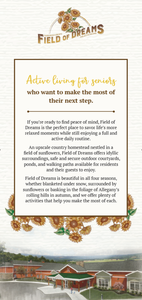
Informational rack card:
With rack cards, it’s all about trying to balance the right amount of information with the right visual elements—we want to attract and inform readers and give them a feel for the warm and welcoming atmosphere at Field of Dreams without overwhelming them.

Direct mail piece:
This direct mail piece, sent out to prospective residents in the Allegany community and beyond, keeps it short and sweet, while still differentiating Field of Dreams from other options with its welcoming, upbeat and inclusive tone and vibrant imagery.


Other branding elements:
We helped ensure the new Field of Dreams brand was visible in every detail in everything from the signage on the new building to smaller assets, like business cards and envelopes.


Sign up for our newsletter...
Give us your email and get our stuff delivered to your inbox. You might not regret it.
Thanks for subscribing! You won't be sorry.
Uh oh. Something went wrong.