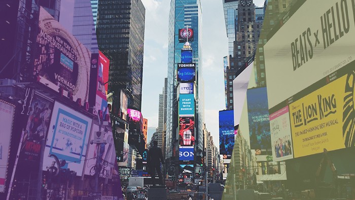
It can be easy to underestimate the value of a billboard. They reach a lot of people, consistently, but in the age of online marketing it’s often assumed that billboards are either ineffective or that the design doesn’t matter because of the high traffic.
We see this a lot – an ineffectively-designed billboard, because someone undervalued its power.
We saw one of these recently. A great opportunity in a high-traffic area, and a company that was trying to make the most of this opportunity.

There is a lot of information on this billboard. There’s information about online pricing options. There are 15 logos (besides their own) showcasing some or all of the car manufacturers they sell. There are some additional design elements, a list of locations and a URL.
There’s a lot going on. Where does your eye automatically go? Where was it supposed to go? In the :03 timeframe you have to look at this billboard, do you think you’d be able to read and digest all the information?
Here’s the thing about billboards. They’re everywhere. Which means that you have a very short period of time to stand out and grab someone’s attention.
And your audience has a very short window to actually read, understand and remember the message.
It’s difficult to use billboards as a sales tool. A successful billboard is one that quickly engages and leaves an impression. If you’re trying to do more than that, you may need to rethink your strategy.
We reimagined this billboard as an opportunity to make an impression on drivers that, hopefully, will leave Shults Auto top-of-mind next time they’re in the market for a new vehicle.

How did we get here?
We started by shortening the message. In the two to three seconds we have to engage drivers, we don’t want to do too much. Short and compelling is the name of the game.
We got rid of all the “extra” stuff. The other logos. The superfluous messages. The design elements that aren’t adding to the key message.
There were a few different messages in the original billboard. We focused on the one we thought was the most important – Shults has a lot of cars for sale. They have the car you want. In this case, the exact message we chose isn’t as important as the decision to focus on just one. They’ll all drive people to the same website.
We designed that message in a way that will get people’s attention. Everyone is familiar with the cliché ransom note-look. We used design to put an engaging twist on an otherwise fairly common message. It might get a chuckle as drivers pass. Or not. But it will probably grab your attention.
We kept it clean, simple, and engaging. We left the URL, because every billboard needs a call to action. Visit the website to find your car.
Billboards can be a very cost effective way to boost your marketing and drive people to your website. But it’s important to make sure you’re using that space effectively. When it comes to billboards, “less is more” should be your golden rule.
At the end of the day, your marketing should serve a purpose and it should be created in order to satisfy a goal. We believe in simple, compelling messaging and engaging design. Don’t believe the hype – even in our world of Internet marketing, a well-executed billboard can still get the job done.
Sign up for our newsletter...
Give us your email and get our stuff delivered to your inbox. You might not regret it.
Thanks for subscribing! You won't be sorry.
Uh oh. Something went wrong.
